
For this case study i want to start with some personal context. I was an obese teenager. Between the ages of 17 and 20, I lost 25 kilos (proof here) - and it changed a lot. That’s probably why this project meant more to me than just UX.
As part of our broader research into improving healthcare quality and accessibility in the Czech Republic, obesity emerged as one of the biggest problems. More than 60% of Czechs are overweight, and 20% are clinically obese. When we asked experts, “If you could improve public health with one intervention, what would it be?”, the answer was clear: help people lose weight - and actually keep it off.
STOB has been doing just that for over 30 years. They offer weight-loss courses based on cognitive-behavioral therapy - not miracle diets or pills, but proven know-how to help people change their habits long term. They have a trusted, experienced team and a network of instructors across the country.
But their digital experience? Not quite living up to the quality of what they do offline.
Help STOB clean up their digital ecosystem so that people can actually understand what they offer - and find the support they need.
Oh, and do it without a full rebuild, because their CMS is basically frozen in time circa 2010.
“It took me a while to realize that Sebekoučink was a whole different site. I had to Google it.”
And importantly:
Every design proposal was mobile-first. We optimized layouts, content structure and CTA placement for mobile screens, because that’s where most users were. Even small shifts, like moving sign-up buttons higher or reducing cognitive overload on scroll, made a big difference.

During research and journey mapping, we identified two core personas representing different stages of the user journey. These helped guide our design decisions and prioritize what content and features to focus on.

Katarína knows she has a weight issue - and she’s not giving up. She finds STOB while searching for nutrition or fitness advice online.
She keeps bumping into scattered tips, trying to apply them in real life, but nothing sticks. She’s doing her best to eat better and move more - but it doesn’t become a habit. She would love to find someone she can trust. Someone with a thoughtful approach that feels structured and makes sense.
She needs to be heard.
“Everyone is pushing their own solution. I’ll trust a specialist who offers something thoughtful and comprehensive.”
Anna has already completed a STOB course - and it worked. She’s happy with the results. Now she’s wondering what the next step should be.
She realizes that what helped most was doing it alongside others - exercising, talking about her health, and being part of something. The community aspect helped her stick with the process and stay mentally balanced.
She’s looking for a nudge toward her next move.
“Your mental state matters a lot. When I feel down or stressed, I gain weight. Food becomes my escape.”
The websites and app were full of good intentions - but also full of stuff to improve. A complete redesign was off the table, so we focused on low-effort, high-impact fixes that STOB’s small team could actually implement.
And while I’m a very UI- and aesthetics-driven designer (I would’ve loved to redo their whole branding), this project challenged me to think practically. Their audience (mostly women 50-70 who’ve known STOB since its radio days) loved it the way it was.
"Usually, when I'm going after something specific, I don't worry about whether it's perfect. So at first glance, it's good."
Hotfix:
We added clear CTAs to the end of articles and client stories and inserted banners with CTAs directly into stories and recipes. All lightweight additions that didn’t require backend changes.
Hotfix:
We restructured the homepage to:
All within the constraints of their current layout system.
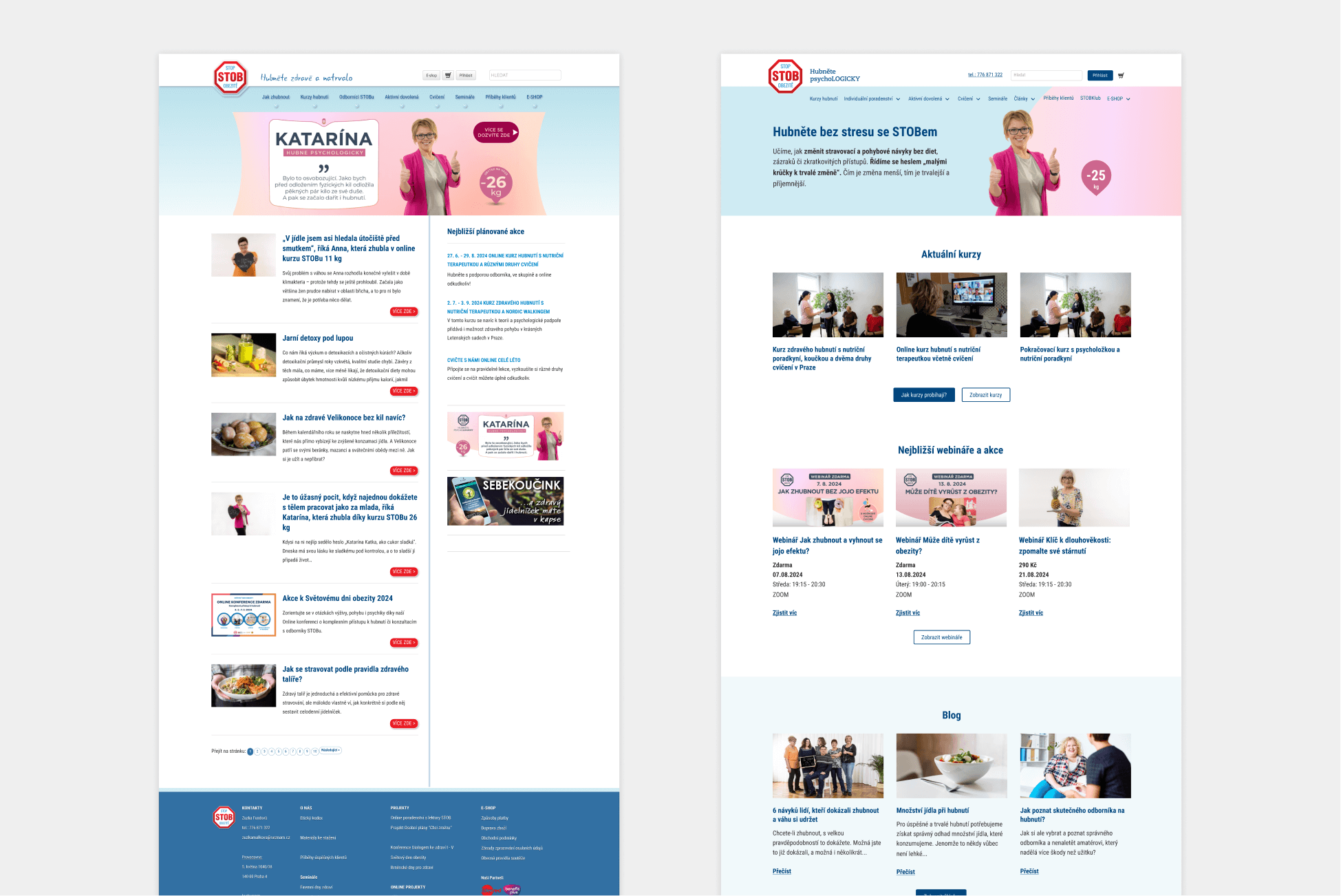
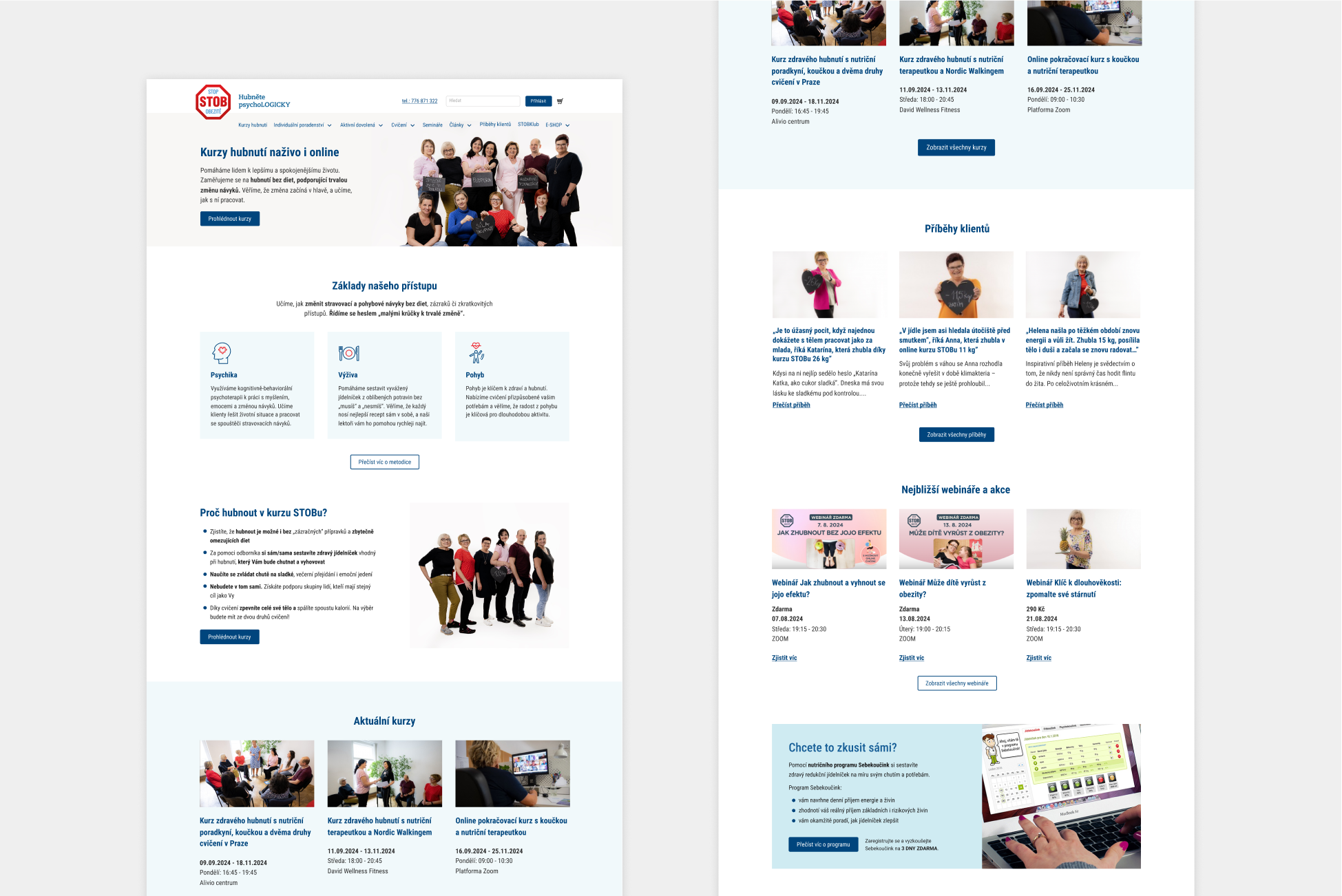
For a service that’s been helping people lose weight for over 30 years, you'd expect it to have a clear spotlight. But nope - their most important offering was buried deep in submenus and scattered mentions. There was no single place where people could actually understand what the courses are, how they work or how to sign up.
Hotfix:
We created a dedicated page that clearly explains:
We also structured it to match the mindset of someone considering change - starting with reassurance, followed by details, then a gentle nudge to act. Small fix, big value.
Hotfix:
We designed prominent visual banners (instead of sidebar boxes that looked like ads) to guide users toward:
Hotfix:
Users expected a practical step-by-step guide. What they got was a sea of 20+ articles.
We proposed:
Hotfix:
Instead of rewriting the app (not an option), we designed a carousel-style intro using visuals from the app. This gave new users clarity without changing core app logic - just by adding a friendly layer on top.
Hotfix:
We proposed:
We didn’t fix everything. But we found the 20% of UX issues that, once addressed, could dramatically improve understanding, engagement and conversion - without overhauling the system or draining the budget.
As a bonus, I also proposed a light UI refresh as part of the MVP+ scope - just enough to modernize the look without reinventing the wheel.
I led the project from end to end, working closely with another UX designer and a CJ/business designer. My responsibilities included:
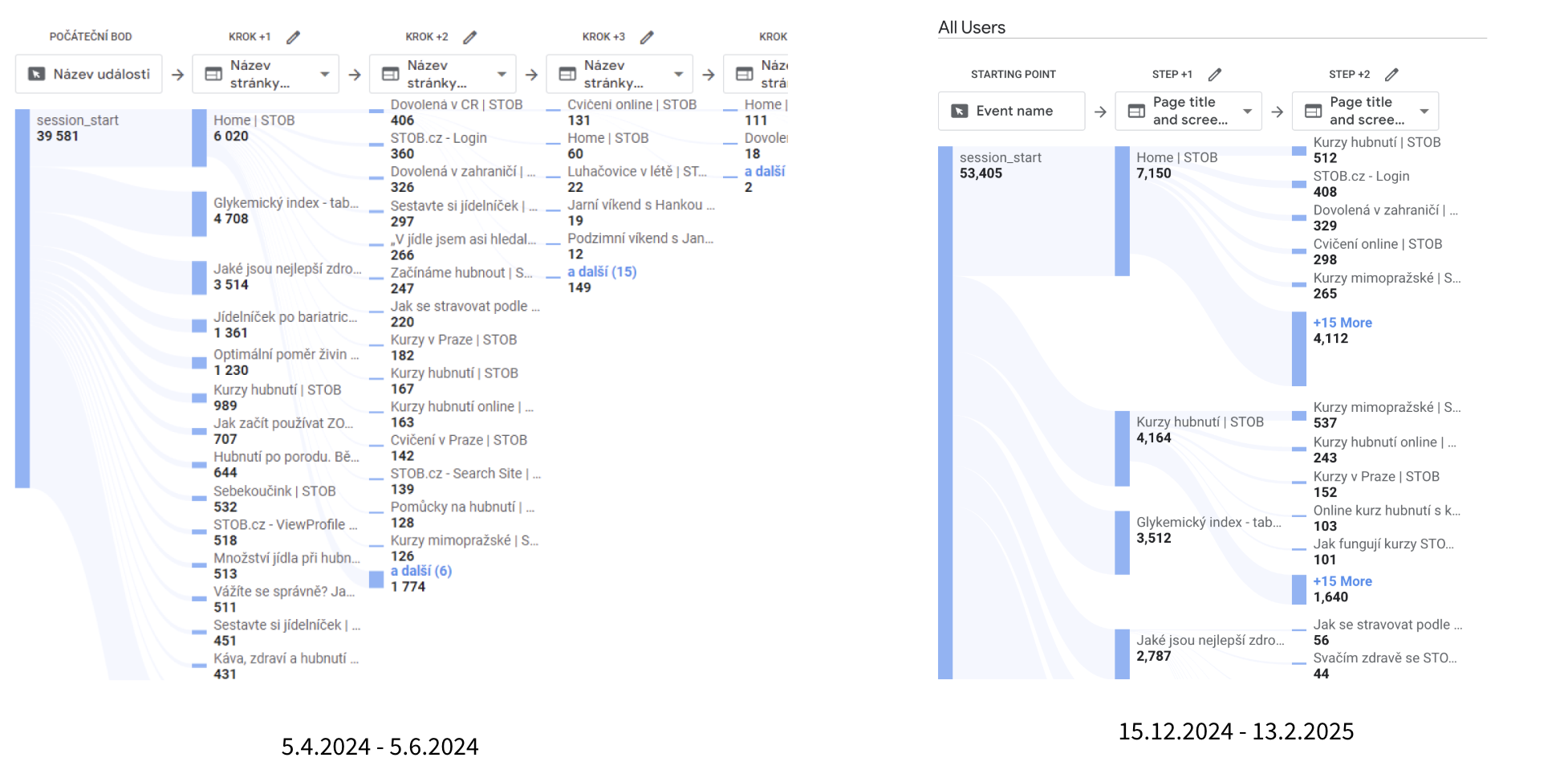
According to GA:
.jpeg)


I’m currently available for part-time roles.

.png)